A sporty business card: the identity of a hockey coach
Published on September 14, 2026 · 3 min read
The brief
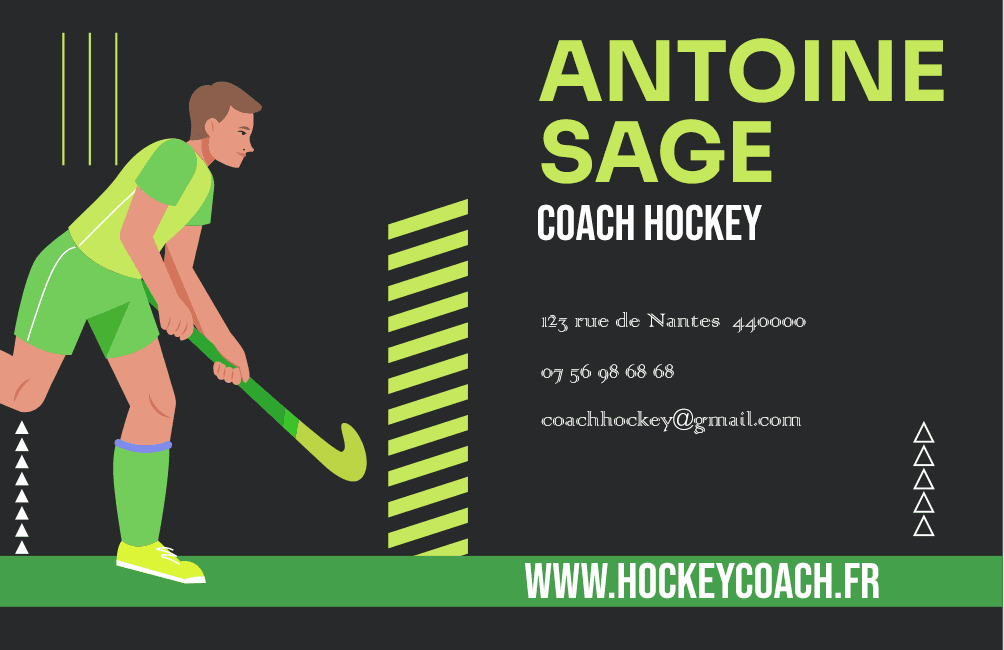
A bold, sporty business card for a hockey coach. The challenge: stay professional — it's a networking tool — while reflecting the energy and dynamism of the sport itself.
The process
Same method as the LOC VOITURE card: Illustrator to build the logo and layout in vector, Photoshop for the retouching and visual finishing. Lime green (#84CC16) brings the desired dynamism without the visual aggressiveness a saturated red or orange can carry. The layout stays clean so it doesn't compromise the readability of the contact details, which remain the card's core function.
What I take away from it
A business card always has to balance two goals that can pull against each other: expressing a personality and staying instantly readable. The right balance depends entirely on the industry and the person — there's no universal formula.
Written by Demba Mbow
Digital creator & UI/UX designer, WCAG certified
Was this article useful?
Let's talk about your project